In 1969, Francis Bacon painted his friend and rival Lucian Freud sitting on a cane chair, and split the image across three separate canvases. In 2013, that painting sold at auction for $142.4 million. Six hundred years earlier, Hieronymus Bosch painted the creation of Eve, an orgy of earthly pleasure, and a vision of hell across three hinged wooden panels that a monk could fold shut and carry between churches. Both are triptychs. Both use exactly the same structural idea, for reasons that turn out to be remarkably consistent across six centuries: some images are too big, too important, or too complex to fit inside a single frame — and the gap between panels can be made to do real work.
What a Triptych Actually Is
A triptych (pronounced trip-tick, from the Greek triptychos, "three-fold") is a single artwork divided into three panels or sections. The traditional format features a dominant central panel flanked by two narrower wings, originally hinged so the outer panels could fold closed over the center like doors — a physical necessity for altarpieces that needed to travel or be sealed shut between services. A modern triptych keeps the three-panel structure without the hinges: three separate canvas prints, photographs, or panels designed to hang side by side as one unified composition.
Three characteristics separate a genuine triptych from three pictures that happen to be hanging near each other. Narrative progression — the panels often tell a story left to right, or work from the outer panels inward toward a central focus. Visual continuity — a single scene or horizon line frequently stretches across all three sections, using the gaps between frames deliberately, as a rhythm rather than an interruption. And historically, emphasis through scale — the center panel was traditionally twice the width of either wing, sized so the side panels could fold flat over it for protection.
Five Centuries of Triptychs, From the Altar to the Auction House
The Mérode Altarpiece by Robert Campin (c. 1422–1428), now at The Cloisters branch of the Metropolitan Museum of Art in New York, is a landmark of Early Netherlandish painting that translates the Annunciation into a contemporary 15th-century Flemish home: donors praying in the left wing, Mary receiving the angel in the center, Joseph working in his carpentry shop on the right — sacred history staged inside a recognizably domestic interior.
The Garden of Earthly Delights by Hieronymus Bosch (c. 1490–1510), housed at the Museo del Prado in Madrid, is likely the most famous triptych ever created: a moral narrative read left to right, from the creation of Eve in Eden, through a surreal and crowded landscape of human indulgence, into a nightmarish vision of the consequences of sin. Five hundred years later it still reads as strange and unsettling as anything made since.
The Isenheim Altarpiece by Matthias Grünewald (1512–1516), at the Unterlinden Museum in Colmar, France, was created for a monastery hospital that treated patients with severe skin disease. Its double-hinged wings opened in stages, and the central crucifixion scene was painted with an intensity of physical suffering deliberately designed to offer solace to people whose own bodies were in visible pain — devotional art built for a specific, practical, human purpose.
Francis Bacon revolutionized the format in the mid-20th century by stripping away the religious framework entirely. Three Studies for Figures at the Base of a Crucifixion (1944), at Tate Britain, uses three bright orange panels to isolate agonized, biomorphic figures — establishing the triptych as a vehicle for raw psychological drama rather than scripture. Twenty-five years later, Three Studies of Lucian Freud (1969) applied the same structure to portraiture, and in 2013 it set the auction record referenced above — a price that places it in the same conversation as the works covered in the Jongas guide to the most expensive artworks ever sold.
The Format Never Actually Went Away
Contemporary artists kept reaching for the triptych, and for reasons that track closely with why Bosch and Grünewald reached for it centuries earlier — the format is simply good at holding scale, sequence, and psychological weight all at once.
British-Nigerian artist Yinka Shonibare's The Scramble for Africa (2003) translates the multi-panel logic into three dimensions: fourteen headless mannequins dressed in Dutch wax-printed fabric, gathered around a table dividing up the African continent during the 1884 Berlin Conference — a spatial triptych confronting colonial history directly. Video artist Bill Viola's The Raft (2004) projects nineteen people struck by a sudden deluge of pressurized water across three aligned high-definition screens, an altarpiece format rebuilt entirely in slow-motion digital video. Brazilian artist Sandra Cinto builds immersive triptychs in blue paint and white ink, depicting violent oceans and swirling night skies across panels ten feet wide, merging Japanese printmaking with contemporary abstraction.
And in fine art photography specifically, Canadian artist Jeff Wall spent over a year digitally compositing dozens of individual exposures into A Sudden Gust of Wind (after Hokusai) (1993) — a monumental three-part lightbox reconstruction of a 19th-century Japanese woodblock print, covered in full in the Jongas guide to conceptual art. It remains one of the clearest demonstrations that the triptych is not a historical relic photographers occasionally borrow — it is a structure the medium has made genuinely its own.
The Real Difference Between a Triptych and a Sliced Photo
Here is the distinction that separates serious triptych photography from a decorative trick: anyone with Photoshop and a print lab can slice a single wide photograph into three panels. Very few photographers actually compose a triptych in the field, deciding at the moment of the shutter click how three separate frames will function as one piece.
The difference shows up in two places. First, the gutters — the two or three inches of bare wall between framed panels — are a blind spot. Slice a panorama after the fact and a tree trunk, a shoreline, or a person's silhouette can land directly in that gap, chopped in half by an accident of framing rather than a decision. A photographer who plans for a triptych from the start positions the horizon, the leading lines, and the key subjects so nothing critical falls where the frame border will interrupt it.
"An intentional triptych often is not one photograph sliced into three at all — it is three genuinely separate exposures, shot to function together."
Second, and more importantly, an intentional triptych often is not one photograph sliced into three at all — it is three genuinely separate exposures, shot to function together. A wide establishing frame, a medium frame isolating the subject, and a tight detail frame. Or the same landscape captured at three different moments — blue hour, sunrise, full daylight — so the wall itself shows time passing. Or three distinct architectural details that only reveal their shared geometry once they are hung side by side. None of that can be produced by taking scissors to a single capture after the fact. It has to be planned before the camera ever comes up to the eye — which is exactly the same discipline that goes into every image in the Jongas fine art photography collections, whether it ends up as a single print or part of a triptych.
Composition Techniques That Make a Photographic Triptych Actually Work
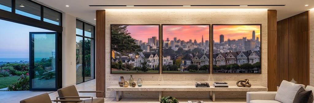
A convincing triptych creates visual bridges that carry the eye across the panel breaks rather than stopping at them. Horizon alignment is the most reliable technique — keeping a shoreline, a mountain ridge, or an architectural ledge locked at precisely the same height across all three frames, so a line entering the left edge of panel one exits the right edge of panel three without a visible jump. Flowing curves — a winding river, an s-curve of coastline — do the same work diagonally instead of horizontally. For architectural or structural subjects, repeated geometry across the three panels (matching arches, columns, or window rhythms) builds a visual beat the eye can follow.
Color and tone have to match with equal precision. If one panel carries cool blue shadow and the next carries warm golden light with no intentional reason for the shift, the set reads as three unrelated photographs rather than one artwork. Converting a full sequence to black and white is one of the most reliable ways to guarantee cohesion, since it removes color temperature from the equation entirely and leaves only form, texture, and tonal balance to carry the composition — part of why so many gallery-quality triptychs live in the Jongas fine art panorama collection and seascape panoramas.
Three layout strategies cover most successful photographic triptychs. A panoramic split takes one continuous wide capture across three panels — ideal for mountain ranges, ocean horizons, and waterfalls where the drama comes from unbroken scale. A symmetrical or anchor-center layout places a strong hero image in the middle, flanked by two complementary or mirroring side panels — well suited to architectural studies or high-detail texture work. A narrative sequence uses three genuinely distinct captures to show motion, time, or progression left to right. Whichever strategy is used, the gutter itself has to be treated as a real design element, not an afterthought — any continuous diagonal line crossing that gap needs to be compensated for during editing, or it will appear visibly broken once the panels are hung.
Why Interior Designers Reach for Triptychs So Often
Ask any interior designer and they will tell you a triptych solves a problem that comes up constantly: a large blank wall that a single piece of standard-sized art simply cannot fill without looking lost. Rather than hunting for one colossal canvas — difficult to transport, expensive to frame, and awkward to hang — a triptych covers the same visual surface area across three manageable panels, while adding structure the single piece could never provide on its own.
The gaps between panels are not a limitation designers work around; they are a feature designers use deliberately. Those vertical breaks create rhythm on a wide wall, visually lift a low ceiling, and add a sense of structured order to open-concept spaces that a single unbroken image can leave feeling flat.
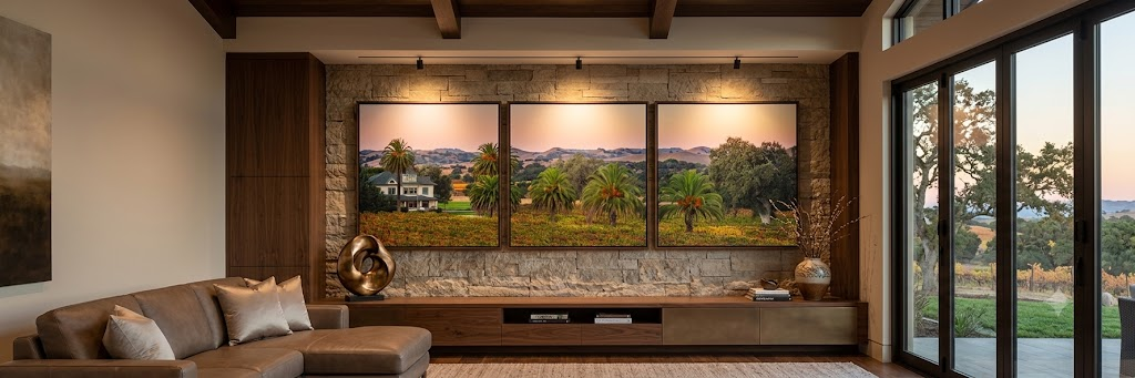
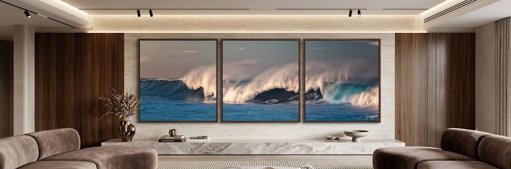
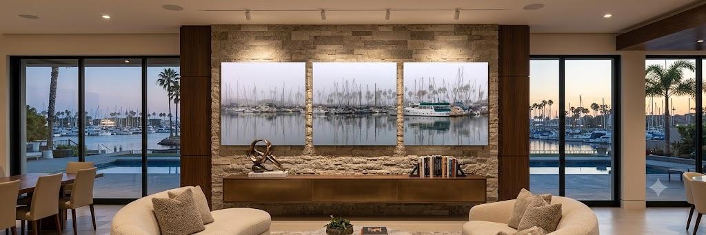
The format also adapts cleanly across almost every interior style. In industrial and loft interiors, bold black-and-white architectural photography across raw brick or concrete reads as gallery-grade without softening the space. In traditional and eclectic rooms, framed and matted panels in identical mouldings read as a considered, collected installation rather than three separate pictures. In coastal and transitional spaces, a panoramic ocean horizon or misty forest split across three panels brings soft, organic tone indoors exactly the way biophilic design principles call for. And in modern and minimalist interiors, high-contrast monochrome photography in thin metal frames delivers maximum visual impact with the least visual noise.
The Exact Rules Designers Use to Hang a Triptych
Professional Installation Guidelines
- Spacing: 2 to 3 inches between panels. Wider and the set loses visual continuity; tighter and the frames read as jammed together rather than deliberately grouped.
- Width: Total combined span (gaps included) should occupy 60%–75% of the width of the furniture piece below. For an 84-inch sofa: roughly 50–63 inches total. Three 16-inch panels plus two 3-inch gaps = exactly 54 inches.
- Queen headboard (~64 in): Aim for 38–48 inches of total triptych span.
- King headboard (~80 in): Aim for 48–60 inches of total triptych span.
- Height above furniture: Bottom edge of frame 6–8 inches above sofa cushion back; 6–10 inches above headboard top. This takes priority over standard gallery eye-level hanging.
- Uniform framing: Identical frames and matting across all three panels are what make a triptych read as one installation instead of three unrelated pictures.
Triptych or Single Panorama? The Honest Trade-Offs
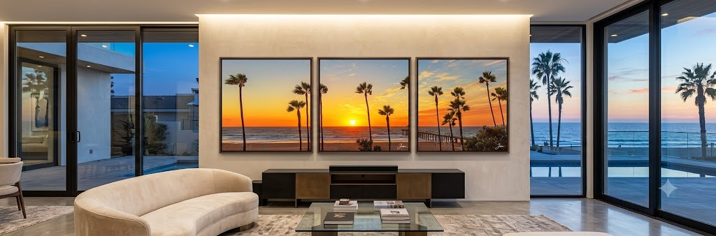
The choice between a three-panel triptych and one continuous 3:1 panoramic print is not purely a matter of taste — it involves genuine practical trade-offs worth understanding before committing to either.
A single panorama delivers an uninterrupted, immersive "window cut into the wall" effect, with the eye gliding across the image with nothing to stop it. It suits clean, minimalist spaces where the goal is one quiet, cinematic focal point, and it works especially well for a highly detailed, continuous scene — a sweeping mountain range or unbroken ocean horizon — where any frame border would risk cutting off something essential. A triptych, by contrast, feels like a deliberate architectural installation rather than a window. It suits rooms with real architectural detail — wainscoting, exposed brick, wall moulding — where the vertical breaks between panels complement lines already present in the room.
The logistics tend to make the decision for a lot of collectors. A single frame spanning 60 to 72 inches needs specialized freight shipping, custom crating, and heavy-duty mounting hardware to get up a stairwell or around a tight hallway corner. A triptych breaks that same footprint into three panels that ship in standard boxes and are dramatically easier to move and install. Framing costs follow the same pattern: acrylic or museum glass gets exponentially more expensive as a single sheet grows larger, while standard-sized panels for a triptych stay comparatively affordable to produce and glaze. And a triptych offers real on-site flexibility — the 2-to-3-inch gaps can be adjusted slightly wider or narrower to match a sofa or headboard precisely, an adjustment a single fixed panorama simply cannot offer.
Getting a Triptych from the Jongas Collection
At the moment, the images offered as triptych splits at Jongas are the fine art panorama collection and the seascape panoramas.
Most panoramas in those two collections were captured in 3 to 1 ratio, horizon held level, no critical subject sitting where it would be lost to a frame edge. They were not necessarily composed to end up as three panels per se. But because they are 3 to 1 panorama they can easily be split into a triptych. They split cleanly into three panels without losing anything essential in between and end up forming 3 perfect square panels that can be displayed side by side with gaps between them.
Each panorama artwork includes a Triptych option as a print variation before checkout, alongside the standard single-panel panoramic print — so the choice between one continuous panorama and a three-panel split can be selected directly from product page - no need to contact me separately. Triptych panels ship as a Lumachrome HD TruLife® Acrylic limited edition prints, sized and spaced using the same 2-to-3-inch gap and 60–75% furniture-width guidelines outlined earlier in this article. For questions about a specific panorama or wall dimensions, reach out through the Meet the Artist page.
The 10 Most Expensive Artworks Ever Sold →
Explore the Jongas Fine Art Collections →
Eddie Jongas is a modern fine art photographer based in Las Vegas, Nevada. His TruLife acrylic-mounted limited edition prints are available exclusively through jongasfineartphotography.com. Free shipping to all 50 states.
