I'll be upfront with you: I'm a photographer, not an interior designer. But I've spent a significant chunk of my life walking into people's spaces to photograph them, hang art in them, or simply exist in them long enough to notice what works and what doesn't. And I've had enough conversations with designers — including a friend who helped outline much of what you're about to read — to have developed some strong opinions about what makes a home feel genuinely great versus what makes it feel like a hotel lobby that nobody lives in.
Contemporary interior design lands on one side of that line more often than any other style. When it's done right, a contemporary home feels effortlessly put-together — warm, calm, intentional, and just interesting enough to keep you looking. When it's done wrong, it feels cold, sterile, and vaguely like a showroom where nothing is allowed to be touched.

The difference between those two outcomes is what this article is about.
First Things First: What Does "Contemporary" Actually Mean?
Here's where most people get confused, and honestly it's a fair confusion because the word is slippery. "Contemporary" literally means "of the present moment" — which means it's technically always changing. Contemporary design in 1985 looked very different from contemporary design in 2005, which looks different from contemporary design right now in 2025.
Think of it as a moving target. It started taking shape somewhere in the 1970s as architects and designers began pushing back against the ornamental heaviness of traditional styles. By the 1990s it had solidified into something recognizable — clean lines, neutral palettes, an emphasis on space and light. Today it's evolved to include softer curves, warmer textures, and a much stronger emphasis on comfort. It still has the bones of that 1990s clarity, but it's grown up and gotten more interesting.
The most common mistake people make is using "contemporary" and "modern" interchangeably. They're not the same thing. Modern design is a historical movement — it refers specifically to mid-century modernism, the Bauhaus-influenced aesthetic of roughly 1920–1970, with its flat roofs, open floor plans, and Eames chairs. Contemporary design is what's happening right now. Modern is a period. Contemporary is the present tense.
The core philosophy of contemporary design, if I had to summarize it in one sentence: less is more, but not at the expense of warmth. It borrows minimalism's discipline — the refusal to clutter, the respect for negative space — but rejects minimalism's cold austerity. A great contemporary room should feel calm, not sterile. Edited, not empty. Comfortable, not clinical.
The Foundation: Color, Light, and Breathing Room
Every successful contemporary interior starts in the same place: a neutral backdrop. Whites, warm greys, soft beiges, deep charcoals — these are the base coat of the style. Not because neutrals are boring (they're not, when used well), but because they function as a canvas. They let everything else in the room — the furniture, the textures, the art — do the talking without visual static in the background competing for attention.
The most common beginner mistake is going too cool with the neutrals. Pure stark white walls in a room with no warm counterbalance can feel clinical very quickly. The better move is to lean toward warm whites, off-whites with a slight yellow or pink undertone, or greige (the grey-beige hybrid that has quietly taken over contemporary interiors for good reason). These shades reflect light beautifully and make a room feel alive rather than empty.
Speaking of light — in contemporary design, light isn't just functional. It's a design element. Maximizing natural light is always priority one. Large windows, glass doors, minimal window treatments. If you're renovating, this is worth investing in. If you're working with what you have, it's worth being strategic about what you place near windows — you want to enhance the light, not block it.
Artificial lighting in a contemporary space is typically layered. You want three types working together: ambient (the general overhead fill), task (focused light for work surfaces, reading areas), and accent (sculptural or directional light that creates mood and highlights specific objects or art). A single flat overhead fixture is the enemy of contemporary design. Replace it with a combination of recessed lights, a statement pendant or chandelier, and some table or floor lamps and the whole room changes register.
Then there's negative space — the deliberate emptiness that contemporary design treats as a feature, not an oversight. In a traditional interior, every corner gets filled. In contemporary design, the empty wall next to the sofa, the open floor beside the dining table, the uncluttered surface on the console — these are intentional. They give the eye somewhere to rest, and they make the pieces that are present feel more significant. More on that when we get to art.
Lines, Curves, and the Furniture That Defines the Room
Contemporary furniture in 2025 is a beautiful tension between two opposing forces: the clean architectural lines that have defined the style for decades, and the organic curves that have recently become its signature move.
Walk into any design showroom right now and you'll see rounded sofas — the kind with no sharp corners, where the arms curve gently into the back in one continuous form. You'll see circular coffee tables, arched floor lamps, curved accent chairs. This isn't a passing trend. It's a correction. For a while, contemporary design got a little too sharp, a little too angular, a little too "architecture rendering" and not enough "place where humans live." The current embrace of curves is the style rebalancing itself, adding softness without abandoning structure.
What works: a sculptural rounded sofa anchoring a living room with clean-lined rectangular shelving behind it. A round dining table (better for conversation than rectangular anyway) with streamlined chairs that have gentle curved backs. An arched reading lamp next to a boxy, structural armchair.
"Contemporary design is curated, not matched — pieces that share a sensibility without being identical, chosen with intention and edited without mercy."
What to avoid with furniture in a contemporary space: excessive ornamentation — fringe on sofas, tassels on pillows, scrollwork on table legs, ornate carved details. These belong in traditional or maximalist spaces. Contemporary furniture should have clean, intentional silhouettes where the form itself is the statement, not the decoration applied to it.
Matching sets. The "matching bedroom suite" or "complete living room set" from a furniture store is the death of a good contemporary room. Contemporary design is curated, not matched. Pick pieces that share a sensibility — similar proportions, a consistent metal finish, a coherent color palette — without being identical.
Visually heavy pieces that sit low to the ground and fill the entire visual field. Contemporary furniture tends to be slightly elevated — legs matter, because visible floor space under furniture makes a room feel larger and lighter. A sofa on short tapered legs reads very differently from one that sits flush on a plinth base, even in the same room.
If you want to go deeper on furniture sourcing and design direction, Houzz has one of the best contemporary design idea galleries online — searchable by room, budget, and specific style. It's where professional designers and homeowners share real completed projects, which is far more useful than abstract mood boards.
Texture and Materials: This Is Where the Soul Goes
If neutral walls and clean-lined furniture are the skeleton of a contemporary interior, texture is the flesh. This is what keeps a contemporary room from feeling like a rendered 3D model of a room — the tactile variation that tells you actual human beings live there.
The classic contemporary material pairing is warm and cool together. Metal with wood. Stone with fabric. Glass with linen. The contrast creates interest without requiring pattern or color to do the heavy lifting. Some pairings that consistently work well: brushed brass or matte black hardware against light oak or maple cabinetry. The warmth of the wood and the precision of the metal balance each other without competing. Chrome or polished nickel reads colder — better suited to spaces where you want more of an urban edge.

Bouclé or textured linen upholstery on furniture set against a smooth plaster wall or stone floor. The contrast is tactile — you can almost feel the roughness of the upholstery against the smoothness of the wall just by looking at it. This is what designers mean when they talk about layering.
Marble or quartz countertops in a kitchen against matte, flat-front cabinetry. The veining in the stone provides all the visual complexity the space needs. Put ornate cabinet doors behind that marble and the room becomes chaotic. Keep the cabinets simple and the stone gets to sing.
Plants are also non-negotiable in a well-done contemporary interior, and they're not just decoration. Large architectural plants — a fiddle leaf fig in the corner, a tall snake plant flanking a bookshelf, a sprawling monstera on a plant stand near a window — do something no other element can: they introduce organic, unpredictable form into a space full of intentional geometry. They also, not insignificantly, make a room feel alive in a way that synthetic objects simply can't replicate. Go big. One large statement plant is better than five small ones scattered around.
The Art Question: What Actually Belongs in a Contemporary Home
This is the part I care about most, obviously. And it's also the part where I see the most mistakes made — not because people have bad taste, but because they treat the art as an afterthought. "We'll figure out the art last." Please don't do this.
In a contemporary interior, art isn't decoration. It's a focal point, often the most important one in the room. Because the space around it is intentionally restrained — neutral walls, edited furniture, minimal clutter — the art carries more visual weight than it would in a busier style. It's the thing your eye goes to first when you walk in. It sets the emotional tone of the room. It is, genuinely, a statement about who you are.
Here's what works best in contemporary spaces, based on what I've seen work in the rooms I've been in and the conversations I've had with designers:
Art Principles for Contemporary Interiors
- Scale up: Art should be roughly 2/3 the width of the furniture beneath it — larger than instinct usually suggests. A small painting over a large sofa reads as an afterthought.
- Black and white photography: The single most versatile choice for contemporary interiors — it anchors the room, adds drama and depth, and doesn't compete with your palette or furniture.
- City photography in B&W: Urban geometry already speaks contemporary design's visual language. Strip the color and it becomes graphic art — structure, light, and line as pure statement.
- Abstract photography: Rooted in the real world but delivering pure visual feeling — shape, tone, and emotional response without color to anchor the viewer.
- Panoramic landscapes: Strong horizontal presence for wide walls, hallways, and above-bed placement; cinematic quality in black and white.
- Acrylic mounting: Face-mounted to clear acrylic, this presentation gives blacks extraordinary depth, highlights a subtle luminosity, and eliminates the frame that would fight the wall.
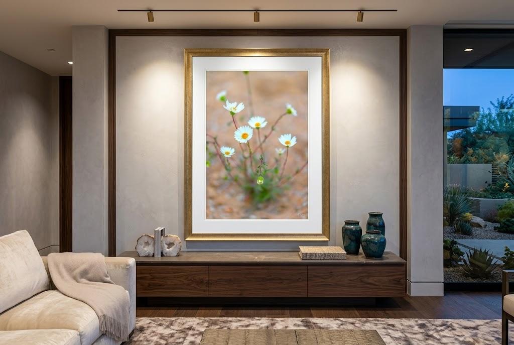
Large-scale pieces. In a contemporary interior, bigger is almost always better when it comes to art. A small painting over a large sofa looks like an afterthought. A large-format piece — something that commands the wall, that you don't have to lean in to appreciate — reads as intentional. The general rule of thumb is that your art should be roughly 2/3 the width of the furniture beneath it, which often means going larger than your instinct tells you to.
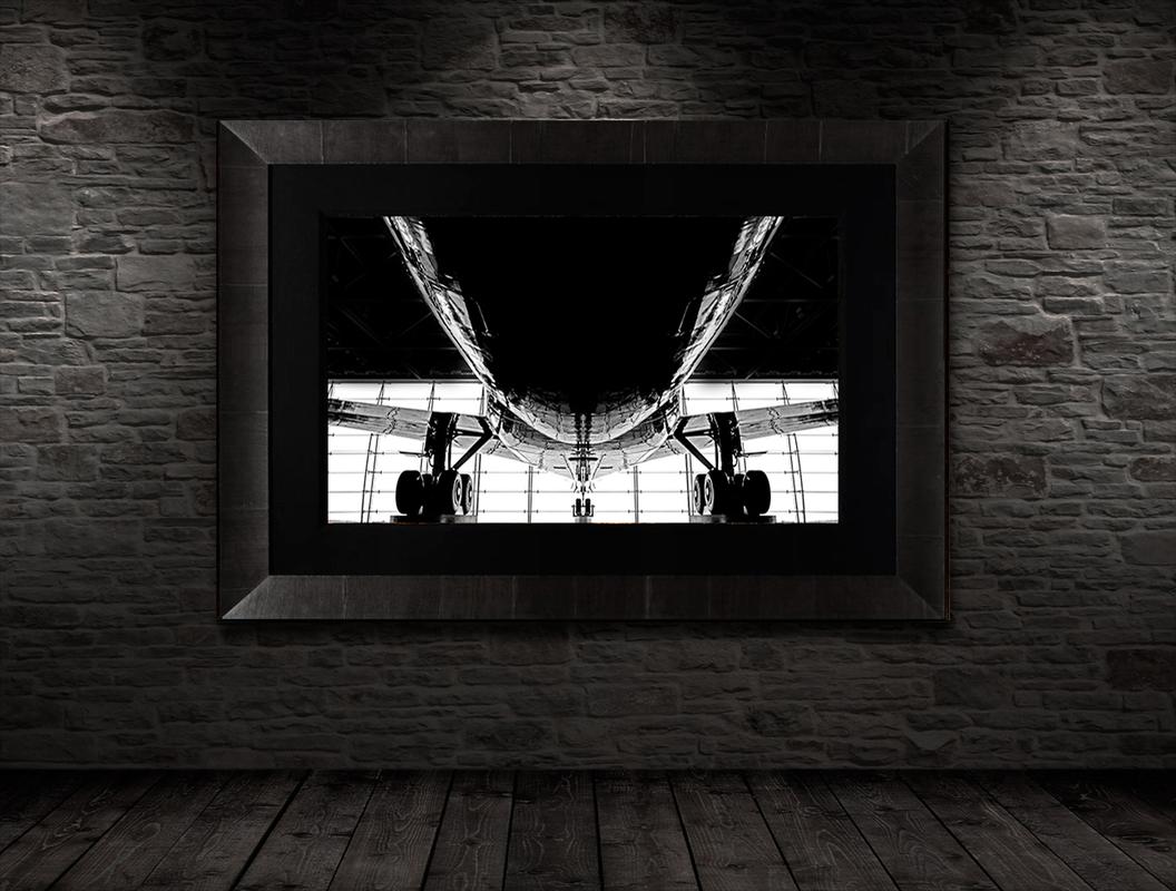
Black and white photography — the single best art choice for a contemporary home. I'll be direct about this: if I had to pick one type of art that works in virtually every contemporary interior regardless of color palette, furniture style, or room size, it's large-format black and white photography. And I'm not just saying that because I shoot it.
Here's why it works so well. Contemporary interiors are built around neutral backdrops — whites, greys, warm beiges. Colorful art in a room like that can easily become a visual fight: the art competes with the furniture, the rug, the throw pillows, the plants. Black and white photography doesn't fight anything. It anchors the room. It adds drama and depth and genuine emotional weight without introducing a color that suddenly has to be "matched" to everything else. It's the most versatile art choice for this style, full stop.

Beyond the practical reasons, there's something about the timelessness of black and white that suits contemporary design philosophically. Both strip away the non-essential. Both ask you to focus on form, light, and composition rather than surface decoration. A large black and white landscape on a warm white wall, mounted on acrylic — that's not a decoration. That's a room.
The subjects that translate best to contemporary interiors in black and white: dramatic landscapes with strong contrast and defined shapes, cityscapes where the geometry of architecture becomes abstract, tree photography where the structure of branches against sky reads as pure line and form, and long-exposure water or motion work where the tonal gradations become almost painterly. You can browse the black and white photography collection here — these are the pieces I'd look at first when furnishing a contemporary space.
City photography in black and white. If anything amplifies the black and white argument further, it's city photography. Urban architecture — the geometry of glass towers, the steel of bridges, the pattern of streets seen from above — already speaks the same visual language as contemporary design. Strip the color out and it becomes something closer to graphic art. The lines sharpen. The contrast intensifies. The image stops being a photograph of a place and starts being a statement about structure and light. Large-format black and white city photography on a feature wall is, in my experience, one of the most consistently successful art choices for contemporary living rooms and offices.
The city photography collection covers Las Vegas, San Francisco, New York, and other cities — shot as fine art, not tourist snapshots. Many of these images work beautifully in black and white and are available that way. If you've got a contemporary space with a large open wall, this is where I'd point you.
Abstract photography. Contemporary design and abstract art have always been natural partners, and abstract photography in particular brings something unique: it's rooted in the real world (the camera records actual light, actual texture, actual form) but the result is pure visual feeling. Abstract photography in black and white takes that a step further — without color to anchor the viewer, the image becomes entirely about shape, tone, and the emotional response those trigger. For a deeper look at what abstract art actually does and why it works the way it does, I wrote a fairly extensive piece on abstract art on this blog that's worth reading before you shop.
Panoramic landscape photography. For rooms where you want horizontal presence — a wide living room wall, a long hallway, above a bed — large panoramic landscape prints are a strong choice. In black and white especially, a wide panorama of a mountain range, a coastal scene, or an open sky has a cinematic quality that works beautifully in contemporary spaces. The fine art panoramas collection has a number of pieces that translate well to monochrome and are available in formats designed to fill a wall properly.
The print surface matters. In a contemporary home, how art is presented is as important as the art itself. Framed prints with mats look traditional. Canvas has warmth but softens the image. For a contemporary space — and for black and white photography in particular — acrylic-mounted prints are the right call. The image is face-mounted to a sheet of clear acrylic, which gives the blacks extraordinary depth and the highlights a subtle luminosity. The surface has a quiet glow. And there's no frame to fight with the wall. It's clean, modern, and the contrast in a black and white image printed this way is genuinely stunning in person.
Room by Room: A Quick Practical Guide

Living room: Start with your anchor piece — the sofa. Everything else should be chosen in relation to it, not independently. Use a rug to define the seating area, especially in an open-plan space where the living zone needs a visual boundary. Choose one statement piece of art for the main wall and resist the urge to fill every other surface. One great piece of art is a room. Six okay pieces of art are visual noise.
Kitchen and bathrooms: This is where integrated storage earns its money. The whole point of a contemporary kitchen is that it looks like there's no kitchen when it's not in use — appliances hidden, surfaces clear, everything behind flat-front doors. Hardware is the detail that makes or breaks it: cabinet pulls and faucets are the jewelry of these rooms. Don't cheap out on hardware. It's a small investment that has an outsized effect on how the room reads. For a deeper guide to selecting art for rooms with specific challenges, check out the office artwork selection guide on this blog — much of the logic applies to any room where you want the art to work hard without overwhelming.
Bedroom: The bedroom in a contemporary home should be a sanctuary of calm, not a showroom. Tonal palettes work best here — different shades and textures of the same color family rather than high-contrast combinations. The art can be quieter than in the living room — something that rewards slow looking rather than demanding immediate attention. A single large black and white landscape or abstract photograph works beautifully here: soft in subject, strong in presence, and with no color to disrupt the tonal calm you've built with the rest of the room.
Dining room: The dining table is the anchor and the art above or near it is the conversation. A statement pendant fixture is as important as the table itself — arguably more important, because it defines the scale and mood of the room from above. Don't match the wood of the table to the wood of the floor to the wood of the shelving. Let each element have its own material identity and rely on proportion and color to create cohesion.
The Pitfalls: What Goes Wrong and How to Avoid It
The trend trap is real. Contemporary design evolves constantly, and the temptation to incorporate every new aesthetic that crosses your Instagram feed is strong. The result of chasing every trend simultaneously is a room that looks current for about eighteen months and then feels dated — a kind of visual mortgage you have to keep refinancing. The smarter approach: invest in timeless anchor pieces (furniture, flooring, significant art) and swap out smaller, cheaper elements (cushions, small decorative objects, plants) when you want to refresh the room's feeling.
The "too many metallics" problem. Mixed metallic finishes — some brass, some chrome, some matte black, some copper — can look intentionally curated or like you couldn't make up your mind. The rule most designers use: one or two dominant metal finishes throughout the space, with a third used sparingly as an accent. Pick your lane and commit to it.
The sterile showroom effect. A room with perfectly placed furniture, perfect neutral walls, and zero evidence of human personality. This happens when people are so focused on getting the aesthetic right that they forget to put themselves in the room. The fix is usually art — a piece that reflects who you actually are — or books, or plants, or one genuinely personal object that's allowed to just exist without being "designed." Contemporary style is incredibly forgiving of one honest, personal element that isn't perfectly coordinated. It's not forgiving of a room that looks like nobody lives there.
If You Want to Go Deeper
If you're seriously considering redesigning a space and want professional guidance, Houzz's directory of interior designers is searchable by location and style — you can filter specifically for contemporary designers and see their actual work before reaching out. For those who prefer a DIY approach and want to learn the fundamentals properly, Coursera has solid interior design foundations courses from legitimate universities that cover color theory, spatial planning, and the principles behind what makes a room work.
On this blog, we have a growing collection of interior design articles that approach the question from the art and photography side of the equation — which is, admittedly, my perspective. Worth reading alongside this one:
Art Beyond Aesthetics — Why Art Enhances Your Home — the case for why art in your space is about more than decoration, and why it matters psychologically as well as visually.
Elevate Your Space with Large Wall Art — a practical guide to going large with art and why scale changes everything.
How to Choose the Right Office Artwork — applies to any space where you need art to work hard in a functional environment.
Beach Style Interior Design Ideas — if contemporary isn't quite the right fit and you're drawn to something warmer and more coastal, this one explores that direction.
Case Study: Wall Decor for a Living Room — a real example of how we approached art selection for a specific living room, which makes the abstract principles in this article concrete.
And if you want to browse art with contemporary interiors specifically in mind, the two collections I'd point you to are the city photography collection and the panoramic fine art collection — both printed on TruLife acrylic, both available in large formats, and both designed to be the thing your eye goes to first when you walk in the room.
Which, in a well-done contemporary interior, is exactly the job art is supposed to do.
— Eddie Jongas
Explore Art for Contemporary Interiors:
Black & White Photography Collection
City Photography Collection
Fine Art Panoramas
Abstract Photography Collection
More Interior Design Ideas on the Blog
